
Volume 13 Issue 3 *Corresponding author luiz.ribeiro@uvv.br Submitted 14 jul 2025 Accepted 18 aug 2025 Published 23 oct 2025 Citation RIBEIRO, Luiz Marcello Gomes; Iconographies of a desire - Rio discovered on the wings of the image: visual representations and foreshadowing of the cultural landscape of Rio in Varig posters (1950–1970). Coleção Estudos Cariocas, v. 13, n. 3, 2025.
DOI: 10.71256/19847203.13.3.160.2025 The article was originally submitted in PORTUGUESE. Translations into other languages were reviewed and validated by the authors and the editorial team. Nevertheless, for the most accurate representation of the subject matter, readers are encouraged to consult the article in its original language.


| Iconographies of a desire - Rio discovered on the wings of the image: visual representations and foreshadowing of the cultural landscape of Rio in Varig posters (1950–1970) Iconografias de um desejo - o Rio descoberto nas asas da Imagem: representações visuais e prenúncio da paisagem cultural carioca nos cartazes da Varig (1950–1970) Iconografías de un deseo - Río descubierto en las alas de la imagen: representaciones visuales y presagios del paisaje cultural de Río en los carteles de Varig (1950-1970) Luiz Marcello Gomes Ribeiro1 1 Universidade Vila Velha: Av. Comissário José Dantas de Melo, n. 21. Boa Vista -Vila Velha ES. CEP 29102-920, ORCID: 0000-0002-9904-4139, e-mail: luiz.ribeiro@uvv.br
AbstractDuring the heyday of Brazilian commercial aviation (1950-1970), Varig airlines promoted Rio de Janeiro not only as a destination but also as a symbol of beauty, modernity, and global cultural identity. This article uses a critical methodology combining formal analysis, content analysis, and semiotics to examine how the airline's advertising posters cemented the city as a central tourism product in Brazil. The posters articulated image, desire, and displacement, projecting an aspirational representation capable of influencing the international imagination. The research demonstrates the strategic role of advertising and aviation in shaping perceptions of Rio's Urban Cultural Landscape. Keywords: cultural landscape; tourism, visual identity ResumoNo auge da aviação comercial brasileira (1950-1970), a Varig projetou o Rio de Janeiro não apenas como destino, mas como símbolo de beleza, modernidade e identidade cultural global. Este artigo aplica metodologia crítica combinando análise formal, análise de conteúdo e semiótica para examinar como cartazes publicitários da companhia aérea consolidaram a cidade como produto central do turismo no Brasil. As peças articulavam imagem, desejo e deslocamento, projetando uma representação aspiracional capaz de influenciar a imaginação internacional. A pesquisa demonstra o papel estratégico da publicidade e da aviação na construção da percepção da Paisagem Cultural Urbana carioca. Palavras-chave: paisagem cultural; turismo, identidade visual ResumenDurante el auge de la aviación comercial brasileña (1950-1970), Varig promovió Río de Janeiro no solo como destino, sino también como símbolo de belleza, modernidad e identidad cultural. Este artículo utiliza una metodología crítica que combina análisis formal, de contenido y semiótica para examinar cómo los carteles publicitarios de la aerolínea consolidaron Rio como un producto turístico clave en Brasil. Los carteles articulaban imagen, deseo y desplazamiento, proyectando una representación aspiracional capaz de influir en el imaginario internacional. La investigación demuestra el papel estratégico de la publicidad y la aviación en la configuración de la percepción del Paisaje Cultural de Río. Palabras clave: paisaje cultural; turismo, identidad visual |
Introduction
The cultural landscape of Rio de Janeiro, recognized in 2012 by UNESCO as a World Heritage Site in the Cultural Landscape category, expresses the interaction between nature and urban culture. Natural elements such as Sugarloaf Mountain, Corcovado, and Guanabara Bay coexist with cultural landmarks like the Botanical Garden, the Flamengo Landfill, and the Copacabana waterfront. This recognition reinforces the city's visual identity and highlights the challenges and creativity of the Brazilian people, consolidating Rio as a global icon of cultural diversity and scenic beauty.
These "challenges" stem from the complex interaction between nature and urbanity, requiring creative solutions to integrate natural and cultural landmarks. This "creativity" is expressed both in landscape planning — such as in the Flamengo Landfill or the Copacabana waterfront by Burle Marx, which combine art, leisure, and environmental preservation (Iphan, 2011) — and in social and festive practices, such as Carnival and beach life, which reinterpret the landscape (Perrotta, 2011; Silva and Pinheiro, 2022). This synthesis between nature and culture consolidated the image of a unique Rio, which would be amplified and disseminated by Varig's advertising, transforming it into a global tourist icon.
In this process, the role of commercial aviation stands out, integrated into the productive chain of the tourism economy, whose graphic and symbolic expression crystallized in Varig's campaigns between the 1950s and 1970s. These pieces were decisive in promoting Rio as an international tourist destination, in a context of the airline's expansion, associated with modernity and connectivity. Thus, the city established itself as a global destination, supported by urbanistic and marketing strategies, in which Varig, beyond being an airline, acted as a strategic agent in the consolidation of Brazilian tourism. Its presence on international routes, allied with sophisticated advertising campaigns, positioned Rio as a global tourist product.
Tourism is organized by systems of visuality (Urry, 2001) that structure the desire for travel: one does not travel just to see, but because one has seen. The image, in this sense, precedes the experience. Varig's advertising posters thus played a central role by incorporating iconic elements of the landscape — such as Christ the Redeemer, Sugarloaf Mountain, and the Copacabana promenade — through compositions that went beyond commercial appeal, promoting an aesthetic and symbolic representation of the city, which foreshadowed its current status as an urban cultural landscape (UNESCO, 2012) promoting the city as a symbol of modernity, beauty, and tropical exoticism. In this context, the advertising posters transcend graphic appeal and operate as instruments for constructing the city's symbolic landscape and as commercial tools to boost the leisure industry and cultural consumption in post-war Brazil. Varig's posters synthesize this logic, operating as triggers of desire and anticipating the symbolic consumption of the landscape.
This article analyzes how these posters contributed to the construction of Rio's visual identity, investigating recurring visual elements, their relationship with carioca culture, semiotic aspects, the historical context of Varig's expansion, and the graphic design of the pieces.
Thus, by examining the representation of the carioca landscape in Varig's posters, the research is not restricted to the graphic and symbolic dimension: it also seeks to understand how the airline, as an agent of the Brazilian commercial aviation industry, used such visual resources to consolidate its position in international tourism and, simultaneously, project Rio de Janeiro as a global destination. In this way, the objectives presented here are articulated with the analysis of Varig's role in the genesis of a carioca cultural landscape, mediating displacement, desire, and image in the construction of the tourist imaginary.
Theoretical Framework
The cultural landscape of Rio de Janeiro, recognized in 2012 by UNESCO as a World Heritage Site in the Cultural Landscape category, represents a unique example of the interaction between nature and urban culture. This distinction highlights the peculiarity of the city, where natural elements such as Sugarloaf Mountain, Corcovado, and Guanabara Bay coexist harmoniously with cultural and historical landmarks, such as the Botanical Garden and the Flamengo Landfill. The recognition of this landscape reinforces the city's visual identity and reflects the challenges and creativity of the Brazilian people throughout the centuries. Thus, Rio consolidated itself as a global icon of cultural diversity and scenic landscape beauty.
In the process of constructing this visual identity, advertising stands out in disseminating the image of Rio as the "Marvelous City." In this context, Varig's campaigns between 1950 and 1970 played a fundamental role in projecting Rio as an international tourist destination. This period marked the global expansion of the airline, consolidating its image as a symbol of modernity and connectivity, while the city strengthened itself as one of the world's main tourist destinations, driven by urbanistic and marketing strategies that promoted its idealized image.
It can be attested that Varig's advertising posters played a crucial role in this process by incorporating iconic elements of the carioca cultural landscape, such as Christ the Redeemer, Sugarloaf Mountain, and the Copacabana promenade. The artistic composition of these pieces, marked by the use of vibrant colors, stylized typography, and strategic framing, transcended commercial function, promoting an aesthetic and symbolic representation of the city.
This article aims to analyze the representation and genesis of a carioca cultural landscape in Varig's posters between 1950 and 1970, investigating how these materials contributed to the construction of Rio's visual identity. To this end, it identifies the recurring visual elements and their relationship with the carioca cultural identity; analyzes the semiotic aspects of the pieces, considering the signs and symbols used; contextualizes the posters historically; and explores characteristics of the graphic design, such as colors, typography, and artistic composition, to understand how they reflected the trends of the time.
The analysis of these aspects will allow for an understanding of the role of advertising in the symbolic construction of Rio and its projection as one of the world's main postcards.
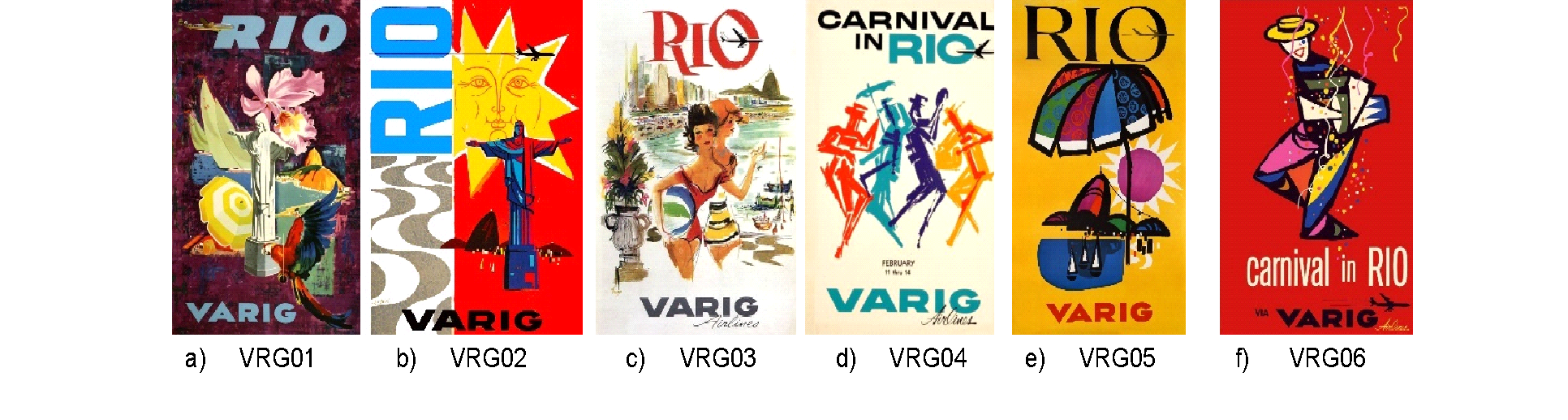
Figure 1 Selection of Varig Posters – Rio de Janeiro, 1950-1970.
Source: Organized and elaborated by the Author, from private collections. 2025.
2.1 Poster VRG01 (1955):
This poster highlights Christ the Redeemer as a universal symbol of Rio de Janeiro and Brazil (Figure 1a). The graphic composition uses vibrant colors and contrasts that emphasize the statue's imposing stature against an abstract background with vibrant colors, reinforcing a connection with spirituality and the city's natural landscape (Varig-Airlines, n.d.).
2.2 Poster VRG02 (1960):
Graphically representing famous carioca postcards, this poster combines geometrized elements and a warm color palette to evoke Rio de Janeiro's natural beauty and modernity (Fig. 1b). The piece reflects the modernist graphic language of the period, influenced by artistic movements such as Neoconcretism (Melo, 2006).
2.3 Poster VRG03 (1961):
This poster celebrates Copacabana, with its iconic graphic design, as a symbol of carioca urban life and leisure (Figure 1c). The composition highlights the interaction between architecture and the natural landscape, using a semiotic approach to convey the idea of sophistication and relaxation simultaneously (Beier, 2024).
2.4 Poster VRG04 (1964?):
Focused on the intangible cultural manifestation of Carnival, this poster uses vibrant colors and dynamic graphic elements to capture the energy and joy of carioca samba and carnival (Figure 1d). The piece reflects Varig's role in promoting Brazilian culture abroad (Fonseca, 2007).
2.5 Poster VRG05 (1968):
This poster once again references the famous carioca postcards. It combines bold, high-impact graphic elements with a warm color palette that evokes the natural beauty and vibrancy of Rio de Janeiro (Figure 1e). The piece reflects a graphic language that was advanced for Brazilian advertising of the time, partly influenced by a specific style of lettering with heavy outlines and analogous colors, similar to the graphic art of Jean Carlu in France (Meggs; Purvis, 2009).
2.6 Poster VRG06 (N.D.):
The "Carnival in Rio" poster exemplifies the convergence between carioca culture and airline marketing in the 1960s/70s (Figure 1f). With vibrant colors and geometrized forms, the piece evokes Carnival, an identity symbol of Rio, while reinforcing Varig's image as the gateway to Brazil, situated within the context of modern graphic design and national tourism promotion.
Methodology
Methodologically, the analysis of the graphic pieces was structured around three complementary approaches: formal analysis, content analysis, and semiotic analysis. The methodological triangulation aims to provide an integrated reading, capable of supporting the article's objectives: to understand how Varig's posters contributed to the construction of the carioca cultural landscape and to highlight the airline's role in consolidating commercial aviation and the tourism economy in Brazil.
- Formal Analysis: This approach seeks to identify and describe visual elements present in the pieces, such as color, typography, composition, and graphic style. Inspired by Rudolf Arnheim (2016), it considers visual perception beyond appearance, addressing the internal structure and essence of form. Gestalt theory (Arnheim, 2016) contributes to understanding how elements are organized harmoniously, reflecting movements such as Modernism and Neoconcretism. Thus, it is possible to interpret visual meanings in relation to the artistic context between 1950 and 1970. This procedure was applied systematically, observing, for example, the use of vibrant color and striking geometry, which reinforce both the graphic modernity of the company and the exuberance of the carioca landscape.
- Content Analysis: This examines the meaning and message conveyed by the posters in light of the historical-cultural context. Based on the methodology of Stuart Hall (1973), it considers forms of encoding and decoding by the audience, assessing how the posters reinforce the image of Rio as the "Marvelous City." The visual reading incorporates preferred, negotiated, and oppositional readings, reflecting power relations and identity construction in the Circuit of Culture (Hall, 1973). The analysis relates recurring symbols (Christ the Redeemer, the Copacabana promenade, Carnival) to forms of audience reception, revealing how these elements reinforce Rio's identity as a tourist destination and Varig's position as a mediator between local culture and the international market.
- Semiotic Analysis: Based on Charles Sanders Peirce (1992), this investigates the relationship between signs and symbols, assessing how graphic elements function as cultural and tourist icons. These signs represent the city through likeness, consolidating an international visual identity. Based on Peirce's categories, we understand how the visual qualities of the posters — firstness, relate to the tourist reality — secondness, and how these relationships are mediated by cultural conventions — thirdness (Peirce, 1992). Continuous semiosis allows the signs to be reinterpreted, shaping the image of Rio in the collective imagination, applied, for example, to the airplane (index of progress and mobility), to Christ the Redeemer (global tourist symbol), and to the anthropomorphized sun (hospitality and tropical exoticism).
The analysis was conducted comparatively, identifying recurring aesthetic and discursive patterns. The three analytical dimensions were articulated: the formal analysis identified visual resources; the content analysis interpreted social and cultural meanings; and the semiotic analysis connected the signs to the global imaginary of tourism and aviation. This methodological integration empirically supports the research objectives, showing how Varig's advertising transformed the carioca cultural landscape into a global symbolic product and projected the airline as a strategic agent of aviation and tourism.
Analysis
- Poster VRG01 (1955): Confluences Between Modernity, Visual Semiotics, and Carioca Identity:
The VRG01 poster (1955) features a vertical composition with variations of purple/burgundy tones (Pantone Coated: 7421 C – Red Wine) and blue (Pantone Coated: 7462 C – Yale), creating a magical and dreamlike atmosphere. The sans-serif typography in sky blue (Pantone Coated: 551 C – Opal) highlights the terms "RIO" at the top and "VARIG" at the bottom of the image, ensuring visual balance.
Figure 2: A subliminal rainbow in the explosion of hues of Poster VRG01
Source: Elaborated by the author, 2025
The composition centers Christ the Redeemer, in white (Pantone Coated: Pantone 663 C – Alabaster) and shadows, as the axis of the scene. Surrounding it are icons of the carioca cultural landscape: an orchid (Cattleya hybridum), a sailboat, a striped beach umbrella with beach items, and a red macaw (Ara chloropterus) in flight. The vibrant palette emphasizes tropicality and Brazilian identity. The concept of cultural landscape, recognized by UNESCO, integrates natural, built, and behavioral elements (UNESCO, 1992). The poster anticipates this concept by articulating visual symbols that reinforce Rio as a leisure destination and an expression of national culture. Christ the Redeemer (Figure 3), inaugurated in 1931, synthesizes this identity emblem.
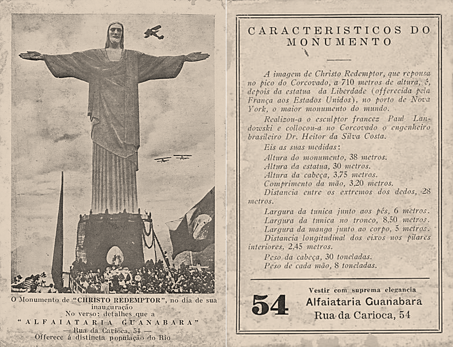
Figure 3: Souvenir; Card from Alfaiataria Guanabara "The monument of Christo Redemptor", on the day of its inauguration: October 12, 1931.
Source: Private Collection, 1931 available at www.harpyaleiloes.com.br. Accessed on: 30 aug. 2025.
From a semiotic perspective, the poster uses coded signs: Christ the Redeemer as an index of Rio and the tropical elements as symbols of Brazil, evoking exoticism and a tropical climate. The composition proposes a synthetic visual narrative, typical of modernist travel posters, which prioritized graphic expression over documentary photography (Figure 4). The Tachiste background in burgundy/purple and blue, rare in national iconography, suggests a dreamlike vision of the carioca night or dusk. Aligned with 20th-century airline campaigns, the poster promotes experiences. The textual economy reinforces the maturity of the design of the period and reaches both foreigners and Brazilians (UNESCO, 1983).
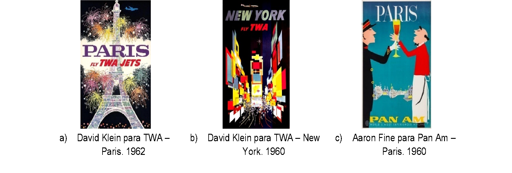
Figure 4: Strength and graphic expression in airline posters from the 1960s.
Source: https://archive.org/. Elaborated by the Author, 2025
The modernist composition and International Typographic Style align with Varig's expansion phase and the consolidation of graphic design in Brazil. The use of geometrized typography in the logo peaked in 1961 with Jungbluth's Compass Rose, although Futura was already in use since 1955 (Scherer, 2022). The Boeing 707-441 (Figure 5), received in 1960, shows this visual transition (Varig-Airline, n.d.).

Figure 5: Boeing 707-441, Rolls-Royce Conway MK 508 turbofan engine which enabled non-stop Rio-New York flights. On the fuselage, the VARIG logo with Futura typography and on the tail the national flag with the Icarus mark.
Source: Private Collection, Acervo: E. S. Valadão, 1960
The VRG01 poster synthesizes marketing strategies, modernist design, and the symbolic construction of Rio, anticipating the idea of a Cultural Landscape. It reflects commercial promotion aligned with the graphic design of the time, communicating values linked to Brazil's natural beauty, vibrant culture, and tropical exoticism (Varig-Airline, n.d.).
The analyzed poster reflects commercial promotion aligned with the graphic design of the period, communicating values linked to Brazil's natural beauty, vibrant culture, and tropical exoticism. In the formal analysis, the intense chromatic use and balanced composition are observed, reinforcing the clarity of the message and the vitality associated with Rio. The content analysis indicates a preferred reading of welcome and tropical exoticism, compatible with the tourist discourse of the time. Through semiotic analysis, Christ the Redeemer appears as a religious icon transformed into a global tourist symbol, condensing Rio as a unique destination. Beyond graphic sophistication, the poster inserts the carioca landscape into the logic of international leisure consumption, anticipating territorial marketing strategies of Combratur (1958), Embratur (1966), and investments in advertising and discounts for North American tourists (Pimentel and Pimentel, 2011; CNC, 2022).
- Poster VRG02 (1960): Graphic Design and the Construction of Rio's Cultural Imaginary by Varig.
The VRG02 poster, created in 1960 by Nelson Jungbluth (signed), is exemplary in the convergence of graphic design, visual semiotics, and the construction of Rio's tourist imaginary. The piece articulates aesthetic and visual narrative to promote Varig and an idealized vision of Brazil and its tourist capital, anticipating its recognition as a Cultural Landscape. With the inauguration of Brasília (Figure 6) and the expansion of commercial aviation, Varig was consolidating itself as a link between Brazil and the world. This poster not only exalts carioca symbols but also reflects the moment when Varig was consolidating its international expansion, positioning itself as a strategic agent of the Brazilian aviation industry. The poster acts as both promotion and identity construction, reinforcing the collective imaginary about Rio, its landscape, and carioca behavior (Varig-Airline, n.d.).
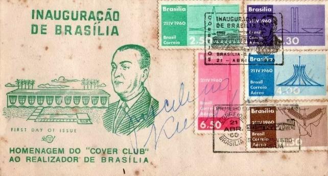
Figure 6: FDC – First Day Cover, EBCT, commemorating the inauguration of Brasília, autographed by President Juscelino Kubitschek.
Source: Private Collection, 1960. Available at: www.vixcolecoes.com.br. Accessed 30 Aug. 2025.
The cultural representativeness of Rio — with Christ the Redeemer, hills, and beaches — was used to create an aspirational image of exoticism, hospitality, and modernity (Perrotta, 2011). The poster integrates these references, reflecting the search for an identity linked to progress and the new era of design and marketing in Brazil (Giumbelli, 2008), with a modernist language and formal stylization.
The centrality of Christ the Redeemer (Figure 7) stands out, stylized yet recognizable, as a visual icon linked to Rio's spirituality and hospitality (Giumbelli, 2008). The Copacabana promenade (Figure 8), with its wave pattern, reinforces the urban character and the experience of leisure in the carioca cultural imaginary.

Figure 7: Christ the Redeemer: stylized forms, tangible symbolism. The heart of Christ [external/internal] was a request by Cardinal-Archbishop Dom Sebastião Leme, aiming to honor the Sacred Heart of Jesus. It represents the love and divine protection over the city of Rio de Janeiro and its inhabitants (Giumbelli, 2008).
Source: Pixabay, photographed by Brigitte Werner, 2012
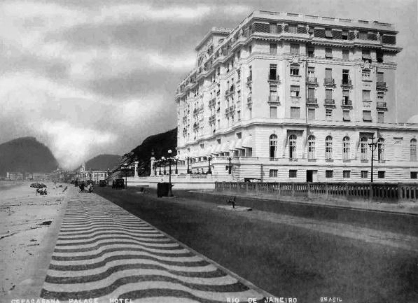
Figure 8: Av. Atlântica with Copacabana Palace and the iconic Portuguese stone sidewalk
Source: Postcard published by Casa J.F.N. Private Collection, 1930.
The asymmetrical structure gives the piece dynamism. The sans serif typography in uppercase for the title "RIO" reinforces clear communication, typical of functionalist design (Figure 9). The contemporary typeface accentuates the modernity of the message and balances with the symbolic graphic elements.

Figure 9: Major brands in the mid-1960s translated their modernity through strong, clean typographies with immediate perception (Meggs, 1998).
Source: Google Images
The color selection in the VRG02 poster (Figure 10) — red (Pantone Coated: 2347 C), blue (Pantone Coated 2191 C) and yellow (Pantone Coated Yellow C) — conveys emotions and values. The red evokes passion and energy; the blue, trust and connection with sky and sea; the yellow, in the stylized sun, symbolizes tropical warmth and luminosity (Thiel, 2019).
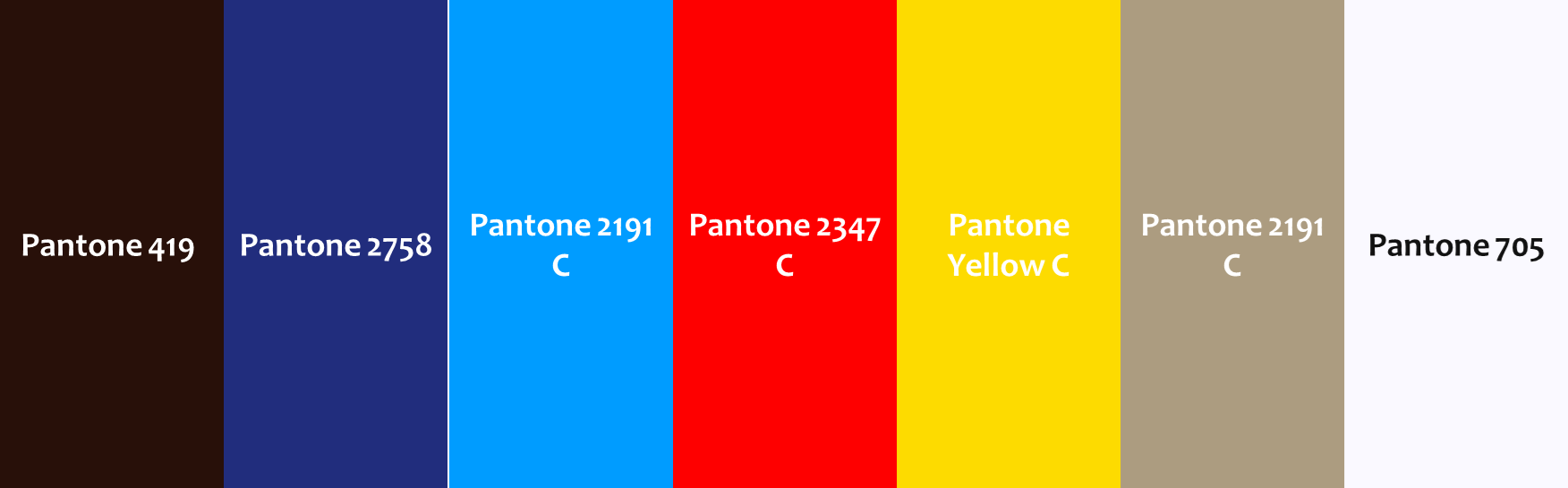
Figure 10: Primary colors highlighted in the hues of Poster VRG02
Source: Elaborated by the Author, 2025
The semiotic analysis of the VRG02 poster reveals a complex network of meanings constructed from visual elements that operate on distinct levels:
Christ the Redeemer, as an iconic element, establishes a direct relationship of likeness with its referent. Its central presence guarantees immediate recognition and acts as an anchor for the poster's visual identity. Similarly, the wave pattern of the promenade functions as an icon of the carioca daily life, representing leisure and urban experience (Yllana; Paraizo, 2020).
Among the symbols present, the sun with a humanized face deserves highlight. This anthropomorphization of the sun king not only translates its deification but also its role as the "source of light, heat, [and] life" (Chevalier; Gheerbrant, 1992, p. 891), with its rays representing celestial or spiritual influences received by the earth. Similarly, the warmth reinforces the idea of hospitality and welcome as elements that structure the human and social experience, and can be associated as they also symbolize protection – values rooted in the imaginary about Rio de Janeiro.
Another symbolic element to highlight, practically a signature in all the analyzed graphic pieces, is the silhouette of the airplane (Figure 11), flying over the scene, acting, subliminally, as an icon of modernity and technological innovation, reinforcing Varig's image as a pioneer in Brazilian commercial aviation (Varig-Airline, n.d.).
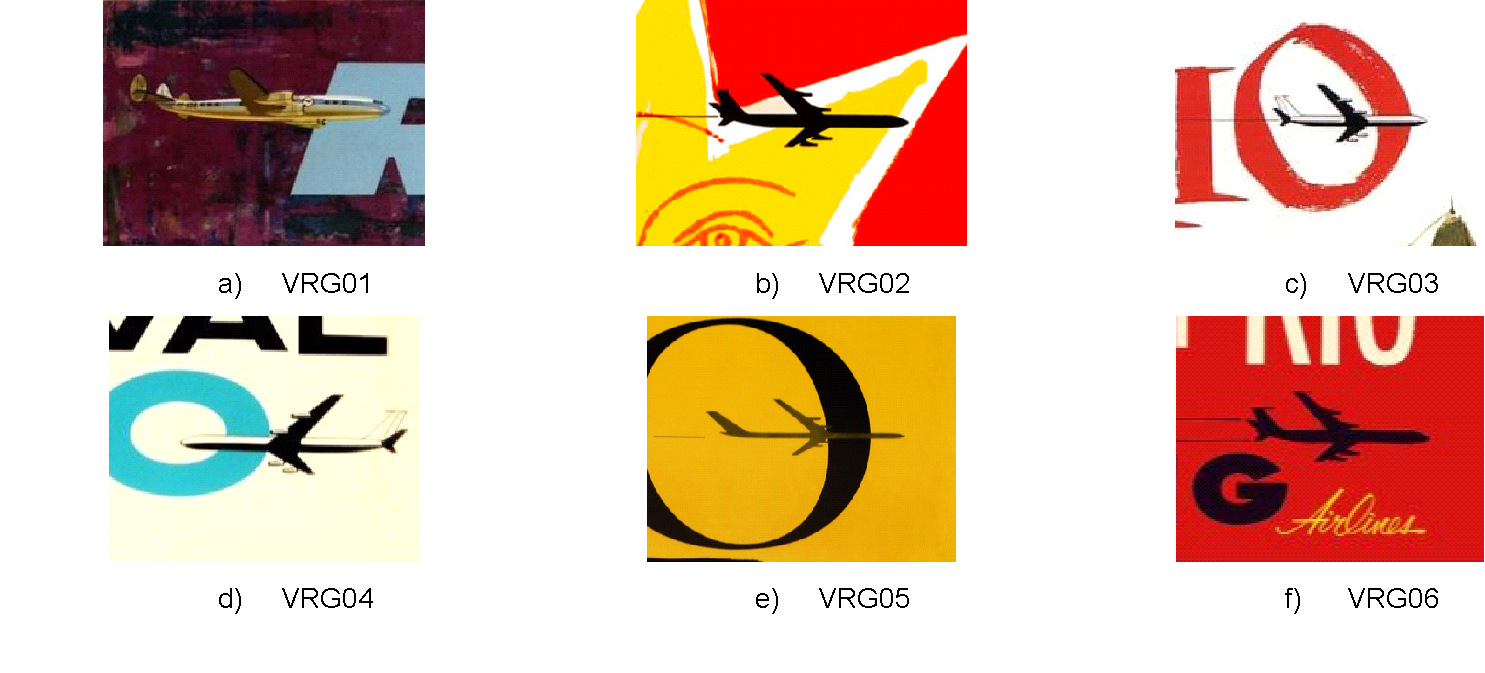
Figure 11: Detail of the Poster with cutouts focusing on the icon of the airplane in flight. Practically a signature in all pieces.
Source: Elaborated by the Author, from a Private Collection. 2025.
In the VRG02 poster, the vertical disposition of the word "RIO" and the use of contrasting colors function as indices of movement, ascension, and progress. These elements suggest that traveling is about realizing a dream: experiencing the enchanting and dynamic environment of Rio.
The contrast between the Copacabana promenade [earth] and the blue title [sky] activates desires and constructs a narrative of cultural transformation. The representation of Rio transcends simple tourist portrayal: it integrates nature, culture, and architecture, valuing regional identity within a context of modernization. This approach unfolds on three fronts:
Synthesis of the Cultural Landscape: Christ the Redeemer, the wave pattern of the promenade, the hills, and the activities in Guanabara Bay (Figure 12) foreshadow a cultural landscape associated with belonging and carioca identity. The celebration of urban and natural uniqueness projects an idealized and vibrant image of Rio (Perrotta, 2011).
International Positioning: In the 1950s-60s, Varig was expanding its international routes, such as Rio-New York and Rio-Los Angeles, and consolidating itself as an ambassador of Brazil (Figure 13). The poster promotes the company and reinforces a modern image of the country, uniting cultural tradition and technological innovation (Varig-Airline, n.d.).
Entertainment Industry: The idealized imaginary of Rio as an exotic and glamorous city was already disseminated by Hollywood and Disney, with Carmen Miranda and Zé Carioca (Fig.14). The poster dialogues with these media, reinforcing a visual narrative that associates tradition with modernity. The identity created by Varig would become a reference in Brazilian graphic and institutional design.
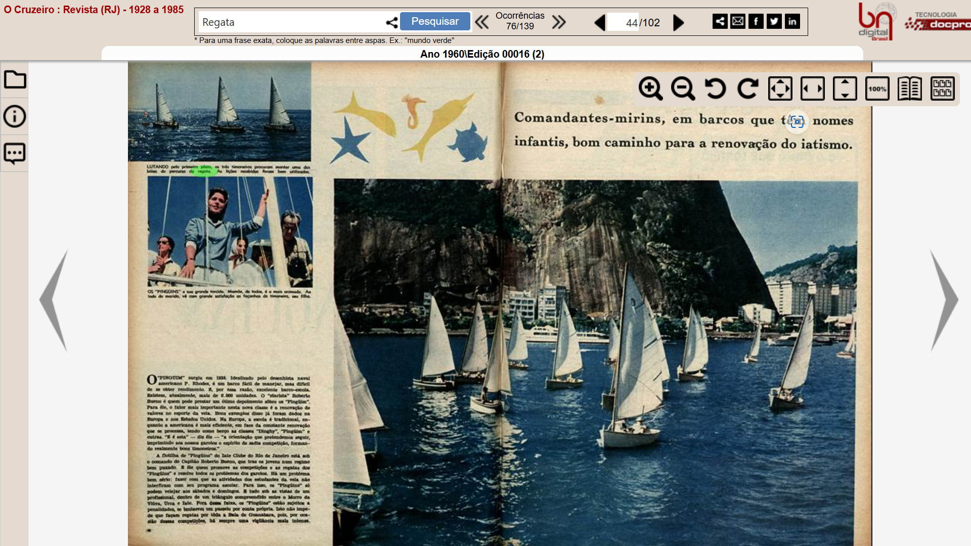
Figure 12: In the 1950s-1960s, the heyday of nautical sports, notably rowing and yachting, filled the pages of magazines like O Cruzeiro, Manchete, among others, reporting major international events such as the Buenos Aires-Rio and Cape Town-Rio regattas.
Source: O Cruzeiro, Edition 016/1960.

Figure 13: Full-page advertisement announcing the launch of non-stop Rio-New York flights, an international pioneering achievement by Varig in 1960.
Source: Revista Manchete, Edition 430/1960
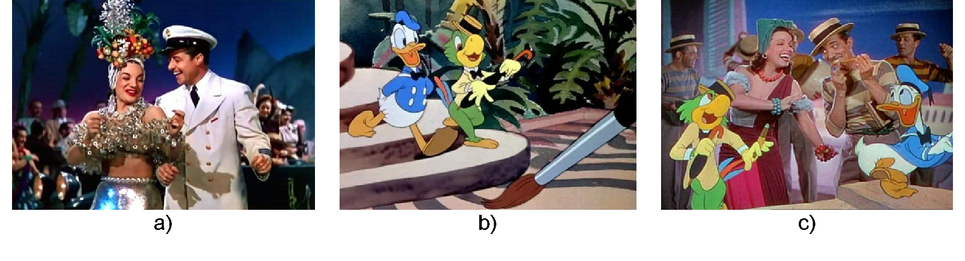
Figure 14: a) Carmen Miranda and Don Ameche in 'That Night in Rio', 1941; b) Donald Duck and Zé Carioca in 'Saludos Amigos', 1942 and c) Zé Carioca, Aurora Miranda and Bando da Lua in 'The Three Caballeros', 1944.
Source: a) IMDB.com; b) adorocinema.com; c) Tumblr.com
The 1960 poster stands out for its innovative graphic language, combining aesthetics and functionality. The reduction of elements to basic forms, such as the stylized sun, the wave pattern of the promenade, and Christ the Redeemer, is typical of modernist design. This visual clarity favors immediate and effective communication (Souza, 2011).
The title "RIO", in sans serif typography, uppercase and robust, demonstrates a clear information hierarchy. The strategic disposition of the elements guides the eye and reinforces the dynamism and modernity associated with Varig.
The red background and the blue title create a striking contrast, highlighting the graphic elements. This expressive combination emphasizes the tradition/innovation duality and constructs a bold and memorable visual identity.
The standardization of visual elements — present in the graphic design, airplanes, and uniforms — reinforces the image of organization and professionalism, transmitting security and coherence (Varig-Airline, n.d.).
The poster articulates modern symbols, such as the airplane and contemporary typography, with traditional carioca icons, constructing a narrative that harmonizes past and present and anticipates the UNESCO recognition. Visual and symbolic elements activate desires and expectations, transforming the journey into an emotional experience. In the formal analysis, the radial disposition of the figures and the typography generate dynamism associated with aviation. Through content analysis, the anthropomorphized sun symbolizes hospitality and tropical joy, compatible with the image promoted by Varig. Semiotic analysis evidences the airplane as an index of progress and modernity, connecting Brazil to the world.
The analysis of the VRG02 poster (1960) shows that the piece goes beyond advertising: it is a visual document that synthesizes cultural and technological transformations. By uniting modernity, tradition, and innovation, Jungbluth promotes Varig and values Rio's identity, foreshadowing its Cultural Landscape.
- Poster VRG03 (1961): Rio de Janeiro as a Desired Destination.
The VRG03 poster, possibly from 1961, is a visual artifact that synthesizes an initial idea of the carioca cultural landscape, Varig's history, and the modernist aesthetic of the period. Its analysis reveals how formal and symbolic elements construct a visual imaginary of Rio as a desirable tourist destination. This study examines its composition, use of color, graphic language, semiotic aspects, and historical-cultural context, as well as its implications for the company's marketing and identity.
The composition balances figurative and landscape elements, guiding the eye towards the interaction between human figures and the carioca setting. In the foreground, two women in swimwear represent elegance and relaxation, alluding to leisure and summer holidays. The one holding the beach ball reinforces the beach culture and sports; the other, gazing at the landscape, invites the viewer to admire the destination.
In the background, Sugarloaf Mountain seen from Copacabana, seafront buildings, boats, and tropical vegetation compose a harmonious urban-natural environment. The poster reinforces Rio as an exotic and sophisticated destination, associating it with Varig's image.
The chromatic palette (Figure 15) is essential to the visual communication. Vibrant tones like red (Pantone Coated: 485 C), yellow (Pantone Coated: 604 C) and orange (Pantone Coated: 158 C) evoke solar energy and the city's dynamism. In contrast, blue (Pantone Coated: 7687 C) and green (Pantone Coated: 7737 C), present in the sea and vegetation, balance the composition, suggesting freshness and well-being.
Figure 15: A new subliminal rainbow in the explosion of hues of Poster VRG03
Source: Elaborated by the author, 2025
The poster's aesthetic recalls mid-century modernism, with simplified forms, strong colors, dynamic compositions, and the original lettering by Vitorio Gheno [signed], still alive at 101 years old. A visual artist and designer from Muçum, RS, Gheno worked at Editora Globo, created book covers, and was art director at McCann Erickson. (Di Primio, 2023.)
For the context of the period, Gheno would have been influenced by artists such as David Klein and René Gruau, this consideration being perceptible in the stylistic approach, which values expressive lines and a sophisticated visual identity.

Figure 16: a) David Klein for TWA, 1950; b) David Klein for TWA, 1960; c) René Gruau, En Terrace, 1952, Lithograph; d) René Gruau for Dior, Diorling, 1963; e) René Gruau for Air France, Côte d´Azur, 1963.
Source: a) b) and c) 1stdibs.com; d) HPrints.com; e) affiche-passion.com
From a semiotic point of view, the VRG03 poster constructs an idealized carioca imaginary, associating Rio with beauty, leisure, modernity, and sophistication. The modern and legible typography reinforces Varig's visual identity. The word "RIO", in large red letters, attracts the eye, while the silhouette of the airplane crossing the "O" repeats the company's visual "signature", highlighting its role as a logistical facilitator of tourism.
The iconographic elements – feminine figures, paradisiacal landscape, and urban features — reinforce Rio's status as a sophisticated yet accessible destination, while positioning Varig as a modern and reliable company, capable of transporting passengers with comfort and safety. The formal analysis highlights the contrast between solid chromatic areas and outlined figures, providing immediate and clear readability. Through content analysis, the joint presence of urban and natural elements suggests harmonious coexistence, reinforcing the carioca cultural landscape. The semiotic analysis demonstrates that such elements function as indexical signs of Rio, internationally recognizable. The poster configures itself as a historical-cultural document that synthesizes the carioca landscape, Brazilian commercial aviation, and the 20th-century advertising aesthetic, evidencing marketing strategies that consolidate the image of Rio and Varig as cultural and tourist references.
- Poster VRG04 (N/D): The Construction of a Tourist-Cultural Institutional Identity in Varig's "Carnival in Rio" Poster.
The VRG04 poster (N/D), "Carnival in Rio", possibly produced between the 1960s and 1970s, represents a relevant graphic piece in Varig's marketing strategy and the construction of its institutional visual identity, as well as in promoting Rio as a tourist-cultural destination. This analysis addresses the poster's form, content, and meaning, exploring graphic, semiotic, and historical aspects, focusing on the visual representation of carnival as reinforcement of the destination concept (Varig-Airline, n.d.).
The composition features stylized revelers in motion, conveying the energy of the carioca carnival. The vibrant palette — red (Pantone coated: 2028 C), blue (Pantone coated: 2235 C), yellow (Pantone coated: 130 C) and purple (Pantone coated: 273 C) — against a neutral background (Pantone coated: 663 C), accentuates the festive atmosphere and dialogues with the city's visual identity (Figure 17). The airplane, present in the upper part, a recurring element in Varig's pieces, symbolically connects the celebration to the travel experience.
Figure 17: New chromatic palette of primary colors with an emphasis on blues.
Source: Elaborated by the Author, 2025.
The modern and elegant typography used in the "Carnival in Rio" poster aligns with the design trends of the period, emphasizing the main information and Varig's sophistication. The inclusion of the dates "February 11 thru 14" (possibly 1964) reinforces its promotional nature. Varig's posters sought to convey modernity and sophistication, reflected in the typography and visual composition, as well as in the image of the city as a destination (Scherer, 2022).
The colors used carry cultural meanings associated with carnival and Rio de Janeiro: red (passion and intensity); blue (sea and sky, linked to the landscape and the airline); yellow (sun, luminosity and energy); purple (magic and enchantment). The stylization of the revelers, without individualized details, emphasizes the collective experience of carnival, where the individual dissolves into the shared artistic experience. Advertising posters reinforce the construction of a cultural visual identity aimed at the target audience (Jorge, 2009).
The VRG04 poster constitutes a Varig strategy to promote Rio — the gateway to its operations — as a luxury and exotic tourist destination, as shown by the advertisement in the Art News Annual magazine (Figure 18). During the 1950s and 1960s, the company played a crucial role in expanding international tourism to Brazil, with sophisticated advertising materials that highlighted the country's cultural and natural value.
The poster's modernist visual language, inspired by Bauhaus and Swiss design, reflects the international trend of simplification and functionality. The visual identity of tourist destinations is essential to consolidate a locality's image, with graphic design as a key element (Silva, 2022).
The VRG04 poster, "Carnival in Rio" by Varig, synthesizes a marketing strategy that goes beyond advertising, becoming a visual document about Rio's cultural identity and its tourist promotion. The analysis of the graphic and semiotic elements reveals aesthetic and communicational choices, in addition to the intersection between design, tourism, and culture. Although the authorship is not indicated, it is possible to attribute it to Nelson Jungbluth, who worked for over 30 years in Varig's Advertising Department.
Through the formal lens, one observes the integration between warm chromatic planes and human figures in motion, evoking vitality. Through content analysis, the festive bodies and the reference to Carnival trigger readings of popular identity and exoticism. In the semiotic analysis, these bodies become symbols of exportable Brazilianness, reinforcing Rio's place as the tourist capital of joy.
Figure 18: Advertisement published in Art News Annual Magazine.
Source: Art News Annual Magazine, Issue 28, November 1958
Advertising posters construct narratives that consolidate cultural and historical values (Rangel, 2015). The VRG04 poster is, thus, a visual artifact of institutional relevance, configuring indications of a Cultural Landscape of Rio.
- Poster VRG05 (1968): Visual Construction of Rio de Janeiro and Carioca Identity.
The VRG05 poster from 1968, attributed to Nelson Jungbluth, is an essential visual artifact for understanding both the tourist promotion of Rio de Janeiro and Varig's identity. This study analyzes the piece's formal, semiotic, and historical elements, showing how the design constructed an idealized and attractive institutional image of the destination.
The composition stands out for its stylized simplicity and geometric forms aligned with graphic modernism. The sunny yellow background evokes Rio's tropical climate, while the emphasis on the name "RIO", in solid black letters, gives presence to the destination. The subtle insertion of the airplane crossing the letter "O", a recurring feature in other pieces, reinforces the association between travel and the city.
The central image features a colorful beach umbrella with a geometric pattern and vibrant colors, symbolizing leisure and beach life, while protecting stylized representations of Sugarloaf Mountain, Guanabara Bay, and sailboats. The sun, with white rays and a magenta center, emphasizes the city's energy and joy.
The vibrant chromatic palette — yellow (Pantone Coated: 110 C), blue (Pantone Coated: 2133 C), green (Pantone Coated: 2273 C), red (Pantone Coated: 2349 C), magenta (Pantone Coated: 2063 C) and black (Pantone Coated: Black 6 C) — acts as a visual sign that references nature, while constructing an idealized image of Rio. This choice reinforces the senses of climate, exuberance, sophistication, and desire, essential to tourist and institutional promotion (Figure 19).
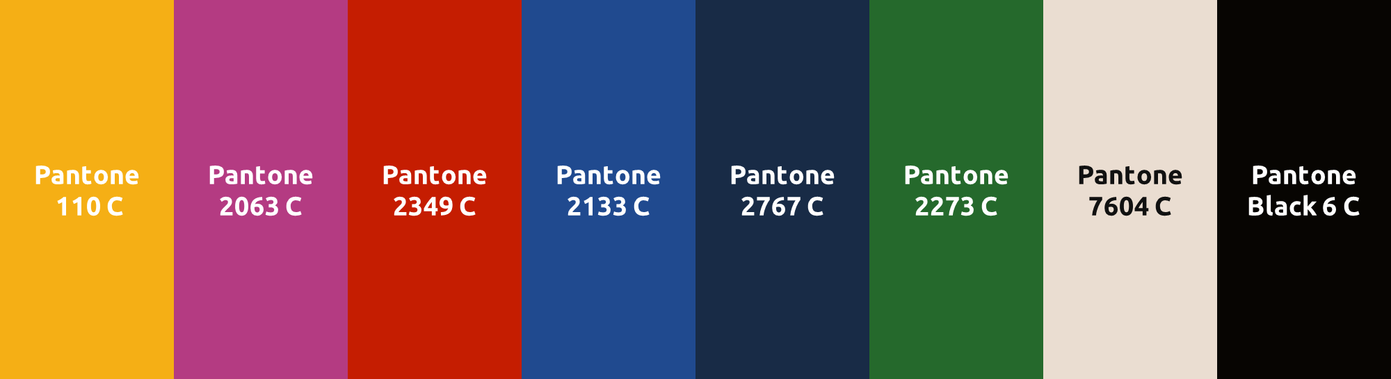
Figure 19: Primary colors augmented with vibrant hues.
Source: Elaborated by the Author, 2025.
The poster transcends aesthetics and contributes to the construction of a cultural identity. The stylization of natural and urban elements reinforces the imaginary of Rio as a tropical paradise, of nature, leisure, and culture (Scherer, 2022).
In the 1960s, Varig was undergoing expansion and international projection. The poster expresses this optimism, associating the brand with modernity, sophistication, and the promotion of mass tourism. The choice of Nelson Jungbluth, a renowned graphic designer, demonstrates Varig's investment in visual communication as a strategy to consolidate its identity and promote Rio as a prominent tourist destination (Varig-Airlines, n.d.).
The design adopts a modernist aesthetic, with formal synthesis and objectivity. Although not fully Neoconcretist, Jungbluth's work shares the valuation of subjective expression. One can also note Tachism in the calligraphy of the black outlines. Compared to other airlines (Air France, Pan Am, United Airlines), the Varig poster stands out for its focus on carioca culture, with a minimalist and idealized representation, as opposed to realistic or eclectic approaches (Figure 20).

Figure 20: Tachism and expressive outlines in airline posters from the 1950s-60s.
Source : https://archive.org/. Elaborated by the Author, 2025
The formal analysis highlights the more synthetic and minimalist graphic use, in tune with international design trends of the decade. From the content analysis, the visual simplification can be understood as a discourse of modernity and cosmopolitanism, bringing Rio closer to global destinations. The semiotic analysis, in turn, interprets the stylization of the promenade as an abstract symbol, capable of representing Rio without the need for literal figuration.
VRG05, from 1968, demonstrates how graphic design acts in the construction of identity and the communication of cultural values. With a sophisticated visual language, the work represents Rio de Janeiro and helps create an imaginary of modernity and prestige, foreshadowing its cultural landscape. Thus, Jungbluth's work constitutes an important case study on the interrelation between art, culture, history, and identity in mass communication.
- Poster VRG06 (N/D) - "Carnival in Rio": Art, Culture, and Marketing Strategy.
The VRG06 (N/D) poster – "Carnival in Rio" presents a vibrant composition with a stylized samba dancer rendered in geometric forms, evoking dynamism and joy. The absence of realism reinforces the modern abstraction linked to Carnival. The human figure connects to carioca culture, where music and dance express cultural identity, foreshadowing the idea of a Cultural Landscape.
The colors – red (Pantone Coated: 485 C), yellow (Pantone Coated: 109 C), blue (Pantone Coated: 7687 C), green (Pantone Coated: 7762 C) and pink (Pantone Coated: 7424 C) – saturated and contrasting (Fig. 21), create a festive effect and project Rio, once again, as an exotic and vibrant destination (Awari, n.d.)
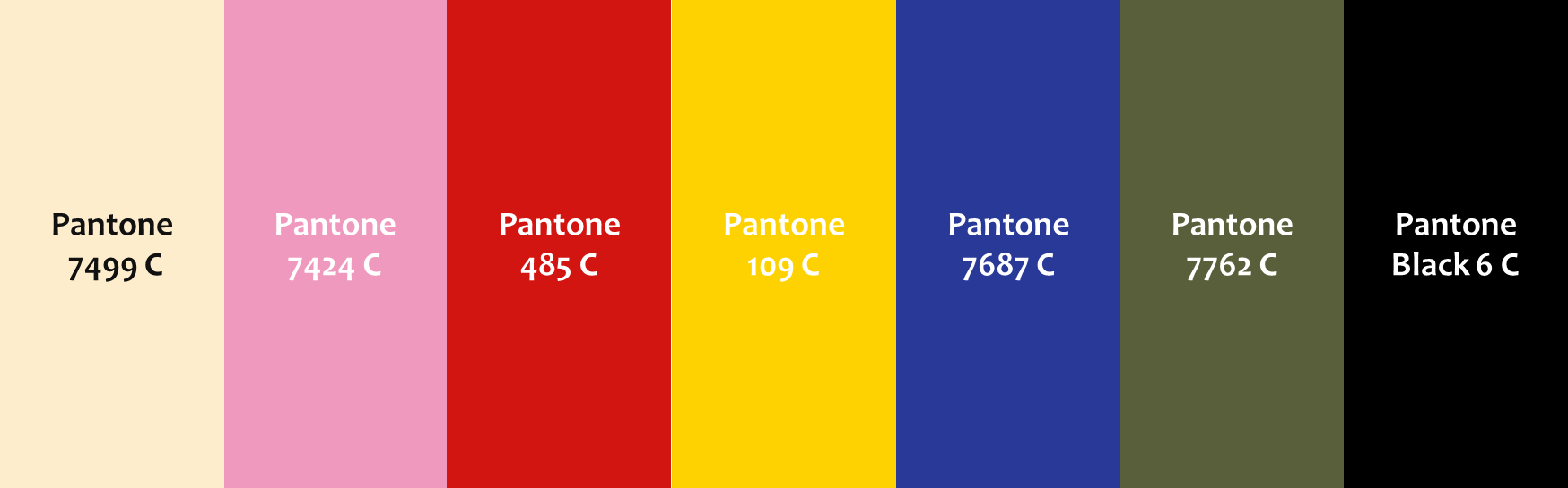
Figure 21: Primary colors augmented with vibrant hues.
Source: Elaborated by the Author, 2025.
Although it does not feature iconic elements such as Christ the Redeemer or Sugarloaf Mountain, the poster evokes the carioca cultural landscape through Carnival, an essential popular manifestation of Rio's identity, linked to its urban and social landscape. The work synthesizes a city marketing approach that associates culture and urbanity with the natural landscape, composing a "Rio brand," a way of being.
Between the 1950s and 1970s, Varig established itself as the leading Brazilian airline. In this context, it heavily invested in international advertising to promote Brazil as a tourist destination. The VRG06 poster, "Carnival in Rio", fits into this strategy, with the apposition "via Varig" positioning the company as the means of access to Rio's cultural richness.
The poster's style recalls late Brazilian modernism with influences from 1960s-70s pop art, marked by simplified geometric forms and expressive use of color. The authorship is attributed to the artist Nelson Jungbluth, responsible for consolidating Varig's visual identity during that period, although there is no official confirmation.
Semiotics is central: the samba dancer and vibrant colors function as indices of the carioca Carnival. The airplane in the lower right corner represents mobility and international connection, while the logo reinforces Varig's corporate identity. The image constructs a visual narrative that associates the pleasure of Carnival with the experience of flying with the company.
Through formal analysis, the poster demonstrates a predominance of graphic Tachism and slogan, translating a direct and objective aesthetic. Content analysis suggests that the choice for graphic reinforcement emphasizes the fluidity and movement of the promised experience, inviting the public to experience the sensation of a cultural landscape. In semiotic analysis, the image of the airplane superimposed on the Varig logo operates as an index of displacement and as a symbol of belonging to a global tourist circuit.
Thus, the poster synthesizes cultural elements and global marketing strategies, reflecting Varig's historical role in Brazil's international promotion and remaining a relevant record of 20th-century advertising graphic design.
Discussion
The analyzed Varig posters present a rich and varied visual representation that foreshadowed the carioca cultural landscape, reflecting artistic and ideological trends of the period. Below, recurring patterns, singularities, and the predominant ideological line are identified.
- Recurring Patterns
- Christ the Redeemer as a Central Symbol and its Connection to International Tourism
In Varig's posters between 1950 and 1970, the representation of Christ the Redeemer reflects a visual and ideological strategy that positions Rio as an international tourist destination. Like other world iconic landmarks, Christ the Redeemer plays a fundamental role in constructing the carioca cultural identity and promoting the city globally.
- Parallel between Christ the Redeemer and Other Global Tourist Landmarks
The use of Christ the Redeemer follows a logic common to other cities that use architectural or cultural symbols to mark their presence in the global imaginary. Monuments such as the Belém Tower, the Eiffel Tower, Big Ben, and the Statue of Liberty express deep-rooted historical, political, and cultural values, functioning as symbolic devices of national identity. The Belém Tower recalls the Portuguese maritime expansion (UNESCO, 1983); the Eiffel Tower, French industrial modernity and romanticism (Betette and Castilho, 2020); Big Ben, British institutional stability (Lewis, 2023); and the Statue of Liberty, democracy and welcome to immigrants (New York, 1976). These landmarks transcend monumentality to project identity values.
Similarly, Christ the Redeemer, visible from various points of the city, acts as a multifaceted symbol of Rio de Janeiro, reinforcing its presence as a recognizable landmark.
- Meanings of Christ the Redeemer in Brazilian Culture
The Christ the Redeemer monument goes beyond the religious dimension and assumes multiple meanings. With its arms open towards the city, it conveys peace, faith, and welcome, reinforcing the image of Brazil as a receptive and hospitable nation (Silva and Pinheiro, 2022). In Art Deco style and clad in soapstone, it represents a synthesis of art and engineering, consolidating itself as an icon of Brazilian modernity since 1931 (Roiter, apud O Globo, 2015). Its location in the landscape of the Tijuca Forest establishes a strong connection between nature and urbanity, functioning as a visual and symbolic focal point of Rio (Menezes, 2001). Its election as one of the New Seven Wonders of the World in 2007 reinforces its status as an emblematic monument of world heritage and a symbol of Brazilian national identity (Giumbelli, 2008).
- Christ the Redeemer in the Analyzed Varig Posters
The stylization of Christ the Redeemer in different visual contexts is observed, revealing its capacity for symbolic adaptation to the multiple narratives of Brazilian culture. In the VRG01 poster, the image of Christ is accompanied by tropical elements, such as the macaw and the orchid, associating spirituality and natural exoticism. The chromatically vibrant composition suggests a celebration of cultural diversity, reiterating the monument's role as an integrating symbol. In the VRG02 poster, Christ is represented with geometrized forms and intense colors, highlighting its modern aspect and its iconographic strength. Integrated with the sun and Sugarloaf Mountain, it composes a narrative that articulates nature, culture, and tourism, projecting a contemporary and internationalized image of the city and Brazil. Thus, the posters demonstrate how Christ becomes a polysemic sign (Saussure, 1972), communicating distinct facets of national identity through graphic and symbolic resources.
- Christ the Redeemer in the Dossier for the Candidacy of the City of Rio de Janeiro as a Brazilian Cultural Landscape
In the Dossier for the Candidacy of the City of Rio de Janeiro as a Brazilian Cultural Landscape, Christ the Redeemer is recognized as one of the iconic elements that compose the city's cultural landscape. It is mentioned in the category of "Associative Landscape," which includes elements with human intervention that project Rio's image in Brazil and the world. The document highlights Christ as a symbol of cultural and religious identity, emphasizing its relationship with the city's natural elements, such as mountains and Guanabara Bay. It is cited as an observation point that contributes to the visual perception, in addition to reinforcing the interaction between nature and urbanization.
The monument is widely used in artistic and visual representations, consolidating its role as a carioca icon (Iphan, 2011). In Varig's posters, it served a strategic function in constructing Rio de Janeiro's international image and foreshadowed a carioca cultural landscape. Represented not only as a religious symbol but also as an artistic, cultural, and tourist element, it connects the city to the global imaginary. Its presence in the airline's graphic pieces reflects an attempt to position Rio among the great world tourist destinations, using a recognizable landmark to attract international visitors.
- Christ the Redeemer in the Cultural Landscape of Rio de Janeiro: an analysis in light of the Icomos advisory report
According to the Icomos advisory report, Christ the Redeemer, atop Corcovado, is one of the structuring elements of Rio de Janeiro's cultural landscape. The report states that "the city of Rio de Janeiro, shaped by the interaction between mountains and sea, developed in an exceptionally dramatic landscape" (Iphan, 2012, p. 1), in which the monument plays a prominent role. It is an essential part of the cultural landscape concept adopted in Rio's designation as a world heritage site: "the serial nomination encompasses all the major natural and structural elements that conditioned and inspired the development of the city" (Iphan, 2012, p. 2).
Beyond aesthetic and symbolic relevance, Christ the Redeemer participates in the city's sensory and cultural experience. The document highlights that "the carioca landscape is celebrated in the arts, including painting and poetry" (Iphan, 2012, p. 37), evidencing how the monument transcends its religious function to become a global icon. The interaction between natural and urban elements is central to characterizing Rio as a living and dynamic cultural landscape.
- Natural Elements as Tourist Attractions in Varig's Posters
The representation of exuberant nature in Varig's posters reflects the valuation of Rio de Janeiro's natural landscape as one of the city's main tourist attractions. Below, the key aspects highlighting this valuation in the analyzed graphic pieces are addressed:
- Sugarloaf Mountain and Mountains
Sugarloaf Mountain is one of Rio's most recognizable natural icons, depicted in posters VRG01, VRG02, VRG03, and VRG05. Its presence symbolizes exuberance and natural beauty, as well as the idea of contemplation and outdoor leisure, like the cable car to the top with panoramic city views (Parque Bondinho do Pão De Açúcar, n.d.).
- Beach, Sun, and Nautical Activities
The carioca beaches, such as Copacabana, Ipanema, and Botafogo Cove, are represented in the posters as spaces for leisure in the sun. This idea is present in posters VRG01 [Beach umbrella and sailboat race in Botafogo Cove]; VRG02 [Sun, Copacabana promenade and sailboat race]; VRG03 [Crystal clear waters, women in swimsuits and fishing boats]; VRG05 [Sun, beach umbrella and promenade].
- Tropical Flora and Fauna
Tropical vegetation is present in posters VRG01 [Orchid and Macaw] and VRG03 [Arrangement with Bromeliads], reinforcing the city's image as an exotic and natural destination (DRUMMOND, 1988).
- Carioca Culture
The landscape influences carioca culture, with outdoor activities reflected in the posters: VRG01, VRG02 and VRG05 [Sailboat races]; VRG03 [Fishing and seaside]; VRG04 and VRG06 [Carnival, samba and drumming].
- Natural Elements and Cultural Practices in the Dossier for the Candidacy of the City of Rio de Janeiro as a Brazilian Cultural Landscape
The Dossier emphasizes the interaction between city and natural landscape, highlighting the harmony between the urban environment and elements such as mountains, beaches, and green areas. Sugarloaf Mountain, Corcovado, and other formations structure the city's landscape. The beaches, especially Copacabana and Ipanema, are fundamental spaces for leisure and sociability essential to the carioca identity.
The Tijuca Forest and the Botanical Garden are highlighted as essential areas for the biodiversity of the Atlantic Forest and the quality of life of the inhabitants. The dossier recognizes Carnival as one of the most relevant cultural manifestations, emphasizing samba and drumming as artistic expressions that represent the joy and spontaneity of the carioca people (Iphan, 2011).
The representation of exuberant nature and the joy of carnival in Varig's posters reflects the importance of Rio's landscape as a tourist attraction and cultural element. The combination of mountains, beaches, tropical vegetation, and carnival creates an exotic and welcoming image, strengthening the identity of the "Marvelous City," so often promoted by Varig.
- Natural Elements, Cultural Practices, and the Cultural Landscape of Rio de Janeiro in the Icomos Advisory Report
The Icomos advisory report highlights that Rio's cultural landscape results from the interaction between natural elements — such as slopes, orography, Guanabara Bay and exuberant vegetation — and cultural manifestations, from architecture to festivities. This union is seen as essential to the city's identity, where the natural landscape composes social life and memory (Iphan, 2012, p. 12).
The natural elements are markers of carioca identity. The singular topography — hills, slopes, and the sea – inspires artistic interventions and reinforces the sense of place. These elements enrich the urban aesthetic and influence the construction of collective memory and the population's sense of belonging (Iphan, 2012, p. 15).
The report also emphasizes that cultural practices — festivals, rituals, and artistic forms — are fundamental to the conformation of the landscape. They animate the spaces and translate the history, social transformations, and ways of life in Rio. Valuing these manifestations is essential for preserving local identity (Iphan, 2012, p. 18).
Finally, the document stresses that the interaction between natural elements and cultural practices defines Rio's physical setting, strengthening a robust collective memory. Preserving this relationship is essential to keeping alive the history and traditions that give the city its singular character and universal value (Iphan, 2012, p. 22).
- Chromatism and Identity: Tropical Luminosity in the Visual Construction of the Carioca Cultural Landscape in Varig's Posters
As observed in the analyses of the different posters, the use of vibrant colors in Varig's promotional pieces about Rio de Janeiro constituted a visual strategy with strong symbolic appeal, which goes beyond aesthetics to configure a cultural narrative. The chromatic choice — marked by saturated and contrasting tones like red, yellow, blue, among others — reflects the city's peculiar luminosity and is inserted into a context of constructing the tourist and affective image of the carioca landscape.
The intense and direct sunlight characteristic of tropical regions is a decisive agent in the formation of the carioca landscape's visual palette. Studies indicate that in tropical environments, solar incidence accentuates the contrast between light and shadow, making colors more saturated and perceptibly vibrant (Fairchild, 2013). The decomposition of natural white light, combined with the city's humid and dense atmosphere, gives the sky, vegetation, and buildings a chromatic intensity that becomes a reference for visual representations of Rio de Janeiro (Ebert, 2010).
In Varig's posters, this intensity is reproduced through the deliberate use of colors that evoke the sensation of heat and vitality, reinforcing the city's solar identity. The combination of the blue of the sky and sea, the green of the vegetation, and the light or grey tones of the buildings establishes a recognizable and suggestive visual repertoire.
The chromaticity employed in the posters is not neutral. It operates as a symbol of carioca cultural vivacity, associated with a cheerful, relaxed, and festive lifestyle. The recurring use of vibrant palettes serves to reinforce positive stereotypes of the city, such as receptivity, spontaneity, and energy (Awari, n.d.). In this sense, red represents the passion and dynamism of popular manifestations, while yellow evokes the sun and hospitality. Blue articulates the natural elements with the sensation of freedom and spatial amplitude. This symbolic coding contributes to fixing the city's tourist imaginary in an affective and memorable way.
Color psychology offers foundations for understanding the effectiveness of this visual strategy. Vibrant hues are perceived with greater emotional intensity and favor positive reactions such as enthusiasm, happiness, and welcome. Furthermore, they are key elements in capturing attention and memorizing advertising images (Yakubu, 2023). In Varig's posters, the use of these colors not only maximizes visual impact but also consolidates a positive and desirable image of Rio. Chromatic communication acts as a sensitive interface between the observer and the represented landscape, mediating emotional experiences that stimulate tourist consumption.
This environmental dynamism inspires representations that are not limited to a faithful reproduction of the landscape, but that capture its sensory and emotional aspects, contributing to a poetic and idealized reading of the territory.
Between the 1950s and 1970s, Brazilian graphic design was strongly influenced by modernist movements, which proposed an optimistic and celebratory visuality of national culture (Santos, 2024). The adoption of intense colors in Varig's posters is aligned with the modernist aesthetic and international advertising trends of the time, which privileged visual impact and communicational clarity. In this scenario, the valorization of popular culture and regional identity manifests through graphic choices that blend brasility, tropicalism, and cosmopolitan sophistication — an effective synthesis for promoting tourist destinations in the international imaginary.
- Colors, Light, and the Integration Between Nature and Culture according to the Dossier for the Candidacy of the City of Rio de Janeiro as a Brazilian Cultural Landscape
The dossier emphasizes the interaction between man and nature, resulting in a singular cultural landscape, where colors and luminosity play a crucial role. The beauty of the Atlantic Forest, mountains that meet the sea, wide bays and coves attracted travelers who recorded enchanting views. The city is seen as a place where nature is stunning, leading the carioca people to build a city that seems like a "second nature," with cultural landscapes that reflect human sensitivity in the face of this unique nature (Iphan, 2011, p. 9).
Contrast is a striking characteristic of the city: mountains covered in forest bordering a sheltered bay, with flat mangrove lands (Iphan, 2011, p. 20). In this context, luminosity and colors in various elements of the landscape stand out. The "great blue landscape of Guanabara Bay" is framed by the green of Flamengo Park. The beaches, like Copacabana, with its Portuguese stone sidewalks, create a vision like in a painting populated by bathers and pedestrians, with undulating mosaics reminiscent of the sea (Iphan, 2011, p. 16).
The slopes and plateaus of the Tijuca Forest, with dense woods, maintain the harmony between Brazilian nature and artistic development. The reforestation of the Tijuca Massif, after deforestation for coffee cultivation, is a successful example of regeneration (Iphan, 2011, p. 56). The white houses, cited by Maria Graham (1824), are mentioned as an element that, together with the mountains, vegetation, flowered islands, and green beaches, makes Rio an enchanting scenario. Architecture, urbanism, and landscaping ally with masterpieces in harmony with the carioca hills, such as the Museum of Modern Art and Flamengo Park (Iphan, 2011, p. 39 and 10).
The sensations transmitted by the carioca landscape, with its colors and luminosity, are linked to local culture. Rio is seen as a unique example of balance between man, city, and nature, recognized as a monument to quality of life and the pleasure of living (Iphan, 2011, p. 9). Travelers were enchanted by the city's beauty, the tropical forest, and the combination of landscape elements. The carioca landscape inspired arts, literature, architecture, and urbanism. The escarpments of Corcovado, Sugarloaf Mountain, Guanabara Bay, Flamengo Park, and Copacabana Beach became iconic representations (Iphan, 2011, p. 39).
The association with carioca culture is evidenced in social practices, such as on the beaches, which became loci of sociability. The beach culture, developed in Copacabana since the 1920s, became a behavioral standard throughout the country (Iphan, 2011, p. 12). The integration between nature and city occurs through the use of streets, seaside spaces, lagoons, parks, and squares, promoting encounters between sea, forest, and city, shaping this cultural landscape (Iphan, 2011, p. 21).
The Iphan dossier reveals that the vibrant colors of the sea and tropical vegetation, the intense luminosity, and the contrasts between mountain, forest, and city are intrinsic characteristics of the carioca cultural landscape. Such sensory aspects influence the construction of the city, the forms of interaction of inhabitants with space, and cultural manifestations. The landscape, with its colors and light, is a fundamental asset that defines Rio's identity and outstanding universal value.
- Colors, Light, and the Integration Between Nature and Culture according to the Icomos Advisory Report
The Icomos advisory report, although more concise regarding colors and luminosity, recognizes the strong influence of the natural landscape on carioca culture and arts (Iphan, 2012, p. 2). The document mentions that the urban landscape was shaped by the location between mountains and Guanabara Bay, which influenced cultural diversity and the arts, such as painting and poetry. The natural luminosity and colors of the sea, vegetation, and tropical sky are implicit in this description (Iphan, 2012, p. 7).
The report states that Rio's beauty inspired works of art, literature, and music. The landscape, with its visual characteristics, served as a recurring theme and defining element of carioca cultural identity (Iphan, 2012, p. 7). The harmony between nature and human intervention in the formation of the cultural landscape is also highlighted. The city developed by taking advantage of its unique geography — which suggests that colors and light influenced the urban aesthetic.
Regarding cultural practices, it is observed that the beauty of the landscape is appreciated by both professionals and amateurs, being part of the local culture (Iphan, 2012, p. 7). The report recognizes the beauty of the carioca landscape as an inspiration for culture and the arts, and as an element that shapes the relationship between nature and city, influencing built spaces and practices of contemplation.
- The Aircraft as a Symbol of Mediation and Modernity
Tourism must be understood within a logic of mobilities, where the journey is as important as the destination (Hannam; Sheller; Urry, 2006). The airplanes present in all the analyzed posters symbolize this experience in motion, conferring aesthetic, emotional, and aspirational value to the very act of flying.
In the analyzed posters, the aircraft can be perceived as a striking element of the visual communication. Far from being mere graphic adornments, the airplanes cut across the skies of the carioca landscape, acting as a symbol of mediation between the tourist and the destination and as a visual signature that consolidated the company as the protagonist in promoting Rio de Janeiro as a high-standard international tourist destination.
This iconography positions Varig as more than just an airline: it is presented as a facilitator of access to a cultural and sensory experience. The airplanes emerge as emblems of symbolic and logistical connection, linking the international traveler's imaginary to the urban and natural landscape of Rio de Janeiro. The importance of shipping and airline companies as agents of this promotion was fundamental.
The tourist posters were designed for commercial purposes by the companies operating transatlantic routes, with Rio as one of their points of embarkation and disembarkation. Thus, they functioned as visual documents for promoting the destination (Roiter, apud O Globo, 2015 and Knauss, apud Motta, 2016).
In the period delimited by this research, Varig assumed a central role in this narrative. By inheriting Panair's international routes in 1964, the company became consolidated and associated with Rio's image. The images in the posters were part of the company's very identity (Knauss, apud Motta, 2016).
Beyond mediating access to Rio, the posters reflected the evolution of Varig's visual identity. Icarus and the Compass Rose, symbols present on the aircraft, functioned as metaphors for flight and daring, reinforcing the company's modernity and reach. The evolution of the airplanes — from the Dornier Wal flying boats to the Boeing 747 jets — visually represented the sophistication of the brand (Varig-Airlines, n.d.).
This visual communication associated flight with a sophisticated, cosmopolitan, and modern lifestyle. The airplanes became icons of desire, status, and technological progress (Airway, 2023).
The constant presence of aircraft in the posters establishes a symbolic relationship between the means of transport and the destination. By depicting airplanes flying over Sugarloaf Mountain, Corcovado, and Guanabara Bay, the advertising materials suggested that the experience began even in the sky, reinforcing Varig as the protagonist in constructing Rio's image as a global and modern city.
This approach reinforced Varig's identity as a symbol of trust and innovation, projecting Brazil in international tourism. The introduction of the Caravelle in 1959 positioned the company as a pioneer in the country's commercial aviation, expanding the reach of tourism to Rio and other cities. The Rio-New York route, inaugurated in 1955 with the Lockheed Super Constellation, marked not only a logistical feat but also a symbolic one, consolidating Varig as an ambassador of the Brazilian destination (Varig-Airlines, n.d.).
Thus, the aircraft icon becomes, in Varig's posters, the link between culture, technology, and tourism, composing an image of sophistication and modernity. This graphic signature strengthened the perception of the company as a direct mediator of access to the carioca cultural landscape, contributing to the consolidation of Rio as a global tourist destination.
- Towards an Ideological Line
Based on the foregoing, it can be inferred that Varig's posters reflect a clear and persistent ideological line promoting Rio de Janeiro as a paradisiacal, vibrant, and culturally rich tourist destination, combining exuberant nature with globally recognizable cultural symbols. This visual ideology positions the city as an ideal space for international leisure, creating an image that transcends mere tourism to become an invitation to a cultural and emotional experience.
The posters highlight beaches, such as Copacabana, with vibrant colors and scenes of leisure in the sun, emphasizing the tropical nature and inviting climate. This valorization of the landscape reinforces the idea of Rio as an earthly paradise, where natural beauty is a central attraction for the international tourist.
Furthermore, they incorporate cultural symbols such as Christ the Redeemer and Sugarloaf Mountain, icons of carioca and Brazilian identity. Combined with scenes of leisure, they communicate a festive and welcoming atmosphere, expressing a vibrant culture that invites the experience of authentic encounters.
The use of strong, luminous colors reproduces the visual experience of Rio, creating an idealized, almost utopian atmosphere that stimulates the desire for travel and discovery. Such idealization functions as a marketing strategy, positioning Rio as a dream destination, accessible and desirable, reinforcing the image of Brazil as a cheerful, exotic, and culturally rich country.
The ideological line emphasizes the coexistence between natural exuberance and cultural wealth, suggesting that Rio offers a complete tourist experience. This visual narrative constructs Rio as a unique destination, where one can enjoy both nature and cultural diversity.
Varig's posters from the 1950s to the 1970s consolidate this ideology by electing elements such as beaches, monuments, and vibrant colors, creating a narrative that reinforces the carioca and Brazilian identity and constructs an aspirational Cultural Landscape for global tourism, contributing to what would later become the recognition of Rio as an Urban Cultural Landscape by UNESCO.
- Varig and the Consolidation of the Tourism Sector in Brazil
By promoting Rio de Janeiro as a desired destination, Varig played a structural role in consolidating the tourism sector in Brazil. More than just an airline, the company articulated displacement, image, and experience. Its sophisticated advertising, especially from the 1950s to the 1970s, functioned as a vector of desire, positioning Rio as the premier national tourist product.
Upon taking over Panair's routes in 1964, Varig established itself as the symbolic gateway to Brazil. The analyzed posters did not merely represent the city; they produced an idealized image, shaped for international consumption.
The tourism economy creates symbolic experiences that simulate authenticity, organizing the landscape as spectacle (MacCannell, 1999). Varig's posters participate in this logic by staging an idealized Rio for global tourist consumption.
By combining landscape, culture, leisure, and modernity, the company became an active agent in constructing a tourist identity for Brazil, mediated by its services, its aesthetic, and its institutional image.
Cultural tourism operates at the intersection of local identity and global desire, promoting places as brands (Richards, 2007). In this sense, the image of Rio in Varig's posters is an inaugural example of territorial branding, where visual and symbolic elements are mobilized to project a desirable and consumable cultural experience in the international market.
Thereby, Varig integrated itself into a logic of pioneering city marketing, avant la lettre, converting Rio de Janeiro into a sellable experience — as an exotic, modern, solar, and hospitable destination — anticipating contemporary strategies of territorial promotion and the recognition of its cultural landscape.
Final Considerations
The analysis of Varig's advertising posters allows us to understand how visual communication contributed to the symbolic construction of Rio de Janeiro as an international tourist destination, anticipating the perception of its consecration as a Cultural Landscape by UNESCO in 2012. These materials, produced between the 1950s and 1970s, operated as tools of mediation between local identity and global projection, integrating nature, culture, and idealization into compositions that translated the city's spirit into recognizable and desirable images.
The tourist landscape, as seen in Varig's posters, is, therefore, a narrative construction of space; a space which only exists as it is practiced and symbolized (Certeau, 1994). These materials, while promoting Rio, consolidated a market logic in which the city was sold as an experience.
The city one sees is not only the one one visits, but also the one one desires, represents, and consumes through signs, images, and narratives that reconfigure the urban experience into a symbolic product. The combined application of formal, content, and semiotic analysis not only offered complementary readings of the pieces but was decisive in achieving the research objectives. The formal analysis identified graphic and chromatic resources that reinforced the modernity and vitality of the carioca landscape; the content analysis highlighted possible social and cultural readings of these symbols; and the semiotic analysis revealed the global dimension of the signs, connecting Rio to the international network of tourism and aviation. This methodological triangulation consolidated the understanding of how Varig's posters acted in the anticipated perception of a carioca cultural landscape and in the projection of the airline as a strategic agent of tourism and aviation.
The use of icons such as Christ the Redeemer, Sugarloaf Mountain, and the beaches of Copacabana, combined with graphic design aligned with the modern aesthetics of the time, gave the posters a symbolic value that surpassed their advertising function, reinforcing Rio's image as a synonym for leisure, hospitality, and tropical exoticism. The inclusion of popular manifestations, such as carnival, expanded this strategy by integrating elements of intangible culture into the city's physical landscape. Far from breaking with the visual tradition, this approach highlighted the plural and dynamic character of the carioca landscape, contemplating natural and architectural attributes as well as cultural practices.
In this way, Varig's posters foreshadow, even if intuitively, an expanded conception of cultural landscape, which transcends the visible and encompasses symbolic, social, and affective experiences. By connecting image, displacement, and desire, Varig structured a narrative of belonging and exoticism compatible with the logic of the nascent tourist economy in Brazil, positioning Rio not only as a tourist destination but as a desirable global product open to reinterpretation by diverse audiences.
The results demonstrate that, by articulating cultural landscape and visual identity, the posters also highlight Varig's role in consolidating Brazilian commercial aviation and structuring the tourism sector. The advertising functioned as a strategic extension of the airline's aerial presence, transforming displacement into a symbolic experience and consolidating Rio as a global tourist product.
References
ARNHEIM, Rudolf. Arte & percepção visual: uma psicologia da visão criadora. 1. ed. São Paulo: Cengage Learning, 2016.
AWARI. Identidade visual do Rio de Janeiro. S.d. Available at: https://awari.com.br/identidade-visual-rio-de-janeiro-a-identidade-visual-do-rio-de-janeiro/. Accessed on: 15 april 2025.
BEIER, Ana Cristi. O que é: História do design gráfico no Brasil. Ana Cristi Beier, 30 april. 2024. Available at: https://anacristibeier.com.br/glossario/o-que-e-historia-do-design-grafico-no-brasil/. Accessed on: 17 jun. 2025.
BETETTE Beatriz. S. S.; CASTILHO Laura. B. As impressões que a Torre Eiffel gerou no território europeu no contexto da revolução industrial e das exposições universais. Revista Artigos.Com, 13, e 2887. 2020 Available at: https://acervomais.com.br/index.php/artigos/article/view/2887 Accessed on: 17 april 2025.
CERTEAU, Michel de. A invenção do cotidiano: 1. Artes de fazer. Tradução de Ephraim Ferreira Alves. 12. ed. Petrópolis: Vozes, 2014.
CHEVALIER, Jean; GHEERBRANT, Alain. Dictionnaire des symboles: mythes, rêves, coutumes, gestes, formes, figures, couleurs, nombres. Paris: Robert Laffont, 1982.
CONFEDERAÇÃO NACIONAL DO COMÉRCIO DE BENS, SERVIÇOS E TURISMO (CNC). Turismo no Brasil: uma história de resistência e conquistas. Rio de Janeiro: CNC, 2024. Available at: https://turismonobrasil.cnc.org.br/livro.pdf. Accessed on: 31 aug. 2025
DI PRIMIO, Fernando. Vitório Gheno: vida, trabalho e arte. Jornal do Comércio, Porto Alegre, 17 aug. 2023. Available at: https://www.jornaldocomercio.com/especiais/reportagem-cultural/2023/08/1119451-vitorio-gheno-vida-trabalho-e-arte.html. Accessed on: 6 may 2025.
EBERT, Carlos. Desafio da luz tropical. ABCine, 01 jun. 2010. Available at: https://abcine.org.br/artigos/desafio-da-luz-tropical/. Accessed on: 17 jun. 2025.
FAIRCHILD, Mark D. Color Appearance Models. 2. ed. Chichester: John Wiley & Sons, 2013.
FONSECA MONTEIRO, Cristiano. A Varig e o Brasil entre o desenvolvimento nacional e a competitividade global. Civitas – Revista de Ciências Sociais, Porto Alegre, v. 7, n. 1, p. 35–58, jan./jun. 2007. Available at: https://www.redalyc.org/pdf/742/74270103.pdf. Accessed on: 17 jun. 2025.
GIUMBELLI, Emerson. A modernidade do Cristo Redentor. Dados, v. 51, n. 1, 2008.
HALL, Stuart. Encoding/decoding in the television discourse. Centre for Contemporary Cultural Studies, 1973.
HANNAM, Kevin; SHELLER, Mimi; URRY, John. Mobilities, immobilities and moorings. Mobilities, v. 1, n. 1, p. 1–22, 2006.
IPHAN. Instituto do Patrimônio Histórico e Artístico Nacional. Dossiê da candidatura da cidade do Rio de Janeiro à Paisagem Cultural Brasileira. Rio de Janeiro: IPHAN, 28 mar. 2011. Available at: http://portal.iphan.gov.br/uploads/ckfinder/arquivos/Dossi%C3%AA%20portugu%C3%AAs%2028%20mar%C3%A7o%202011%20RJ.pdf. Accessed on: 17 jun. 2025.
IPHAN. Instituto do Patrimônio Histórico e Artístico Nacional. Avaliação ICOMOS – Rio de Janeiro. Brasília: IPHAN, [2012]. Available at: http://portal.iphan.gov.br/uploads/ckfinder/arquivos/avalia%C3%A7%C3%A3o%20ICOMOS%20RJ.pdf. Accessed on: 17 jun. 2025.
JORGE, Mariana Aiex. O redesenho de sistemas de identidade visual brasileiros da escola racionalista de design dos anos 1960. 2009. 231 f. Dissertation (Master’s Degree in Design and Architecture) – Faculdade de Arquitetura da Universidade de São Paulo, São Paulo, 2009.
LEWIS, Michael. Big Ben and British Institutional Stability. The British Journal of Politics and International Relations, v. 25, n. 1, p. 85–102, 2023.
MacCANNELL, Dean. The Tourist. A New Theory of the Leisure Class, New York, Schocken Books, 1976.
MEGGS, Philip B.; PURVIS, Alston W. História do design gráfico. Translated by Cid Knipel. São Paulo: Cosac Naify, 2009.
MELO, Chico Homem de. O design gráfico brasileiro anos 60. São Paulo: Cosac Naify, 2006.
MENEZES, Carla Valéria. A apropriação paisagística do Cristo Redentor: natureza e urbanidade na Floresta da Tijuca. Revista Brasileira de Estudos Urbanos e Regionais, São Paulo, v. 3, n. 2, p. 45–61, 2001.
MOTTA, Débora. O Rio como destino turístico: cartazes e história. FAPERJ – Fundação Carlos Chagas Filho de Amparo à Pesquisa do Estado do Rio de Janeiro, 25 feb. 2016. Available at: <https://siteantigo.faperj.br/?id=3121.2.0>. Accessed on: 17 may 2025.
NEW YORK (City). Landmarks Preservation Commission. Statue of Liberty National Monument: Designation Report nº LP-0931. New York: Landmarks Preservation Commission, 14 set. 1976. Available at: https://s-media.nyc.gov/agencies/lpc/lp/0931.pdf. Accessed on: 17 jun. 2025.
O GLOBO. Design no Rio: uma viagem colorida que dá cartaz às belezas cariocas. Rio de Janeiro, 2015. Available at: https://oglobo.globo.com/rio/design-rio-uma-viagem-colorida-que-da-cartaz-as-belezas-cariocas-18054910. Accessed on: 5 mai. 2025.
PARQUE BONDINHO PÃO DE AÇÚCAR. O Parque. Available at: https://bondinho.com.br/pt/o-parque. Accessed on: 17 jun. 2025.
PEIRCE, Charles Sanders. The essential Peirce: selected philosophical writings. Edited by Nathan Houser and Christian Kloesel. Bloomington: Indiana University Press, 1992.
PERROTTA, Isabella. Desenhando um paraíso tropical: a construção do Rio de Janeiro como um destino turístico. 2011. Thesis (Doctorate in History, Politics, and Cultural Assets) – Fundação Getulio Vargas, Rio de Janeiro, 2011.
PIMENTEL, Mariana Pereira Chaves; PIMENTEL, Thiago Duarte. A trajetória das políticas públicas de turismo brasileiras: 1930–2010. 2011. Trabalho apresentado em evento. Available at: https://www.researchgate.net/publication/282667574. Accessed on: 31 aug. 2025.
RANGEL, Rubens. O cartaz político e poético. Belo Horizonte: Universidade Federal de Minas Gerais, 2015.
RICHARDS, Greg. Cultural tourism: global and local perspectives. Binghamton, NY: Haworth Press, 2007.
SANTOS, Pedro. O desenvolvimento da arte gráfica brasileira. Cultura Nova Fase, 5 jan. 2024. Available at: https://culturanf.com.br/descubra-a-fascinante-evolucao-da-arte-grafica-brasileira/. Accessed on: 17 jun. 2025.
SAUSSURE, Ferdinand de. Cours de linguistique générale. 3. éd. Paris: Payot, 1972.
SCHERER, Fabiano de Vargas. As identidades visuais da VARIG – Viação Aérea Riograndense. In: Congresso Brasileiro de Pesquisa e Desenvolvimento em Design, 14., 2022, Evento online. Anais... Porto Alegre: UFRGS, 2022.
SILVA, André Luiz Rodrigues da; PINHEIRO, Alexandre Carvalho Lima. O Cristo Redentor Universal. 1. ed. São Paulo: Paulus Editora, 2022.
SILVA, Renata. Design e turismo: a construção de destinos por meio da identidade visual. Porto Alegre: UFRGS, 2022.
SOUZA, Francisco Raul Cornejo de. As formas da forma: o design brasileiro entre o modernismo e a modernização. 2011. Thesis (Doctorate) – Universidade de São Paulo, São Paulo.
THIEL, Cristiane. Psicologia das cores no marketing: entenda o impacto das cores em nossas emoções e saiba como aplicar esses conhecimentos aos negócios. [S.l.]: [s.n.], 2019. eBook.
UNESCO. Centro do Patrimônio Mundial – Paisagens Culturais. 1992. Available at: https://whc.unesco.org/en/culturallandscape/. Accessed on: 17 april 2025.
UNESCO. Monastery of the Hieronymites and Tower of Belém in Lisbon. Paris: UNESCO World Heritage Centre, 1983. Available at: https://whc.unesco.org/en/list/263/. Accessed on: 17 jun. 2025.
URRY, John. O olhar do turista: lazer e viagens nas sociedades contemporâneas. São Paulo: Studio Nobel:SESC, 2001.
VARIG-AIRLINES Design. Available at: https://www.varig-airlines.com/pt/design.htm. Accessed on: 17 abr. 2025.
YLLANA, Teba Silva; PARAIZO, Rodrigo Cury. O calçadão de Copacabana como patrimônio urbano. In: ENCONTRO NACIONAL DE PESQUISA E PÓS-GRADUAÇÃO EM ARQUITETURA E URBANISMO (ENANPARQ), 2020.
YAKUBU, Paul. O uso estratégico da cor no design gráfico ambiental [The Strategic Use of Color in Environmental Graphic Design] 31 Ago 2023. ArchDaily Brasil. (Trad. Simões, Diogo) Available at: https://www.archdaily.com.br/br/1005890/o-uso-estrategico-da-cor-no-design-grafico-ambiental. Accessed on: 17 Jun 2025.
About the Author
Luiz Marcello Gomes Ribeiro holds a Master's degree in Heritage and Culture from PPGA/UFES, with research focused on the full Baroque period (1668-1713) in Portuguese America. He is a qualified Architect and Urban Planner (UFF, 1991), holds an MBA in Quality and Management with an emphasis on the Third Sector (LATEC/UFF, 2000), and a specialization in Education, Tourism, and Culture (LABOEP/UFF, 2007). He is currently a faculty member at Universidade Vila Velha, teaching in the Architecture and Urbanism, Interior Design, Civil Engineering, and Product Design programs. He works in research and consultancy in cultural heritage, heritage education, and the history of architecture and cultural landscape, with experience in projects such as Tenda da Memória (Itaboraí/RJ, 2008 – UNESCO/IDB/Monumenta) and studies on Protomodern Rationalism in Vitória/ES. Professionally, he has worked on restoration projects and works for companies such as Aresta, Ópera Prima, and Concrejato/Concremat, in addition to having been part of the technical staff of the Roberto Marinho Foundation and working in project management at IOPES/ES.
Author Contributions
Conceptualization, L.M.G.R., methodology, L.M.G.R., software, L.M.G.R., validation, L.M.G.R., formal analysis, L.M.G.R., investigation, L.M.G.R., resources, L.M.G.R., data curation, L.M.G.R., writing—original draft preparation, L.M.G.R., writing—review and editing, L.M.G.R., visualization, L.M.G.R., supervision, L.M.G.R., project administration, L.M.G.R., funding acquisition, L.M.G.R.
Acknowledgments
The author acknowledges the contributions of Professor Marilena Gomes Ribeiro (in memoriam) for the legacy of her Varig memorabilia collection, which sparked and initiated studies on the cultural landscape of Rio de Janeiro through tourism promotion posters.
Conflicts of Interest
The author declares no conflicts of interest.
About Coleção Estudos Cariocas
Coleção Estudos Cariocas (ISSN 1984-7203) is a publication dedicated to studies and research on the Municipality of Rio de Janeiro, affiliated with the Pereira Passos Institute (IPP) of the Rio de Janeiro City Hall.
Its objective is to disseminate technical and scientific production on topics related to the city of Rio de Janeiro, as well as its metropolitan connections and its role in regional, national, and international contexts. The collection is open to all researchers (whether municipal employees or not) and covers a wide range of fields — provided they partially or fully address the spatial scope of the city of Rio de Janeiro.
Articles must also align with the Institute’s objectives, which are:
- to promote and coordinate public intervention in the city’s urban space;
- to provide and integrate the activities of the city’s geographic, cartographic, monographic, and statistical information systems;
- to support the establishment of basic guidelines for the city’s socioeconomic development.
Special emphasis will be given to the articulation of the articles with the city's economic development proposal. Thus, it is expected that the multidisciplinary articles submitted to the journal will address the urban development needs of Rio de Janeiro.